How to test & identify your best app icons in 5 steps
As users scroll through app stores, what’s the first visual element that they see of every single app listed—before the app name, screenshots, etc? App icons.
And with 2.22 million apps in the Apple Store and 3.48 million in Google Play, you can be sure that users have plenty of apps to choose from. Every opportunity that you have to capture their attention is golden.
So, if you’re not making the style and look of an aesthetic app icon a top priority, you need to be.
Obviously, you think the app store icon you have is the best. But do users agree? The biggest mistake is assuming that your opinion or personal taste reflects that of your audience, so there’s really only one way to make sure that app icons are as effective as possible, and that’s through app icon testing.
Here we’ll take you through the complete process of how to properly perform and evaluate testing for app icons. For this, we’ll be using an example from a meditation client.
- Identify the issue
- Formulate a hypothesis
- Create aesthetic app icon variations
- Test the variations and analyze the results
- Determine & implement the winning app icon!
App icon testing steps
1. Identify the issue
For the meditation app we’re using in this example, we noticed a major issue with their app icon: There was a disconnect between the icon displayed on their app stores and what was displayed on their website.
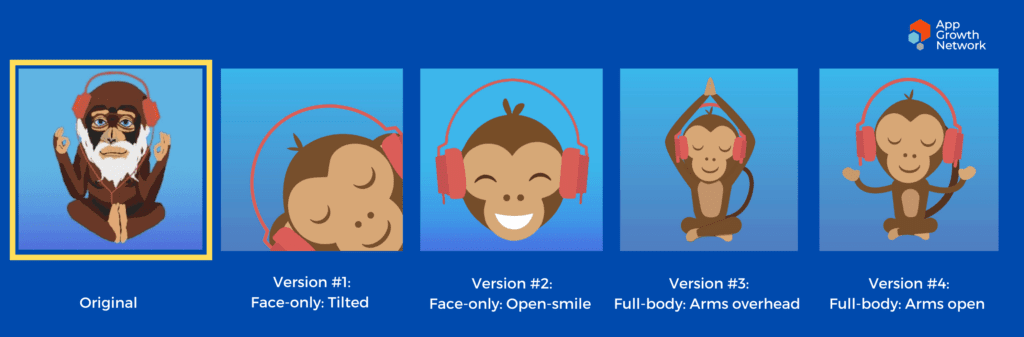
The app store icon for iOS and Android used an older monkey that felt disconnected from their brand presence on their website, which uses a young, unbearded monkey. While the aged, bearded monkey communicated an image of wisdom, the aim in the app icon redesign was for a consistent brand image that called for a more charming and cute character to reflect the positivity and approachability of meditation.
This led to the development of different creative executions to test in order to improve and maximize app store conversion rates.
2. Formulate a hypothesis
Given our observations about the app icon and the branding communicated on the website, we formulated the following hypothesis:
Changing the icon to a cuter, happier monkey will encourage more downloads.
3. Create aesthetic app icon variations
It was important the character itself was tested, not the background. So, the background remained the blue gradient which was consistent with the original icon.
We conducted experiments with the following variations for the monkey:
- Different facial expressions (open-mouth smile vs closed-mouth smile)
- Different views of the body (the monkey’s full body vs. just the monkey’s head)
- Different head positions (straight-on vs. tilted)
- Different body positions (meditating with hands overhead vs by the monkey’s side.)
4. Test the variations and analyze the results
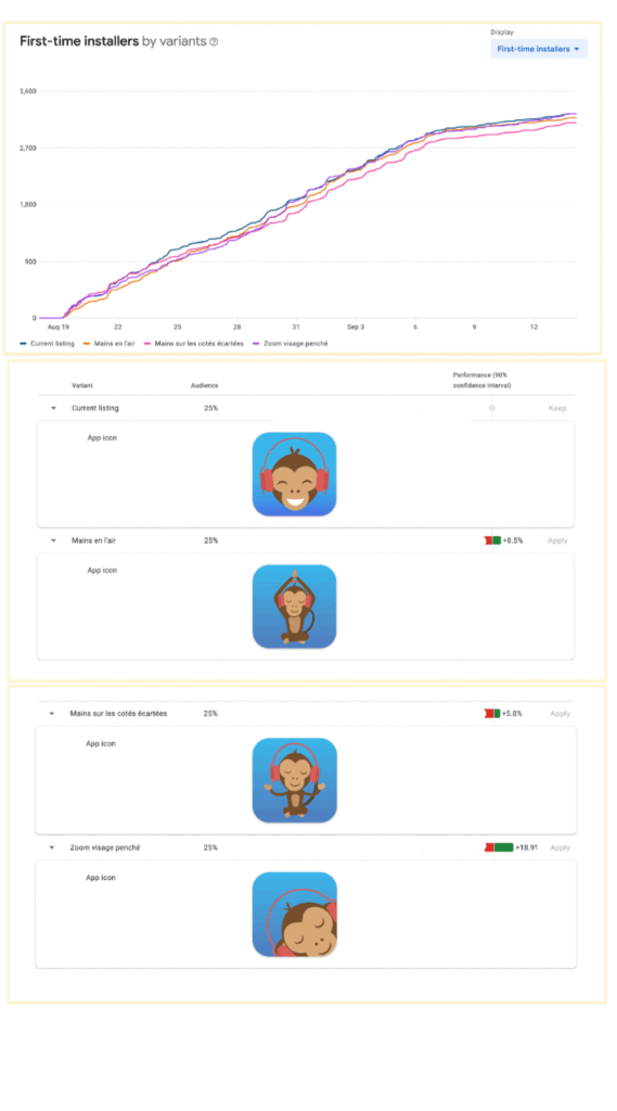
Four variations were tested for a period of two weeks. Based on the results, our hypothesis was confirmed: a happier, cuter monkey displayed more positivity and was better received.
The test also revealed that having the monkey in a meditation pose wasn’t as beneficial to the icon’s success for a meditation app, and that the face-only icons performed better than the full-body icons.
5. Determine & implement the winning app icon!
Numbers speak for themselves. After you’ve conducted testing for the app store icon, the only thing left is to go with the winner.
In this case, the winning app icon was the open-mouth smiling monkey face centered and straight-on.
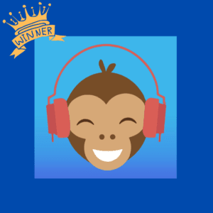
The app icon testing and redesign proved beneficial. After the updated app store icon was implemented, conversion increased 27%.
Final Thoughts
Your app icon aesthetics matter. Not only do they help capture attention but they can significantly improve app store conversion rates.
The only way to know which app icons perform best is to test! When conducting app icon testing, be sure do the following:
- Identify the issue with your current app icon
- Formulate a hypothesis for which to base your icon redesign
- Create aesthetic app icon variations to test
- Test your top icon variations and analyze the results
- Determine the winning app icon and implement in your app store listings
If you’re thinking about an app icon redesign and need some expert guidance and creative development, please don’t hesitate to contact us!

Related Articles

For Wellness apps, the most challenging approach is the conversion of the user from passive to active. [...]
In the realm of App Store Optimization (ASO) for iOS applications, a relatively untapped yet highly effective strategy [...]

In today's competitive app market, it's crucial for app developers and marketers to reach a wider audience and [...]

